Chart of the Day
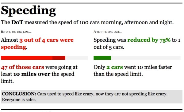
If Power Point presentations are not your thing, check out this nice representation of the DOT’s findings about the new Prospect Park West design. (Although it’s not so new anymore; should we have a birthday party for it in June?) It’s by Jonathan Soma, aka @dangerscarf, and it’s pretty good. Here’s his illustration of the speeding data:
Click to enlarge.
I like his to-the-point conclusions, too. And before a cranky commenter says, “Duh! Of course there’s less speeding! Prospect Park West has been turned into a parking lot!” Soma also has a chart of car throughput that neatly shows that PPW moved the same cars per hour before the redesign as it does now. PPW had extra capacity before the redesign. Now the number of lanes is commensurate with the traffic the street typically handles.
This one is also very good:
Thanks to Jen for bringing it to my attention.


Comments are closed.