The Heat is On
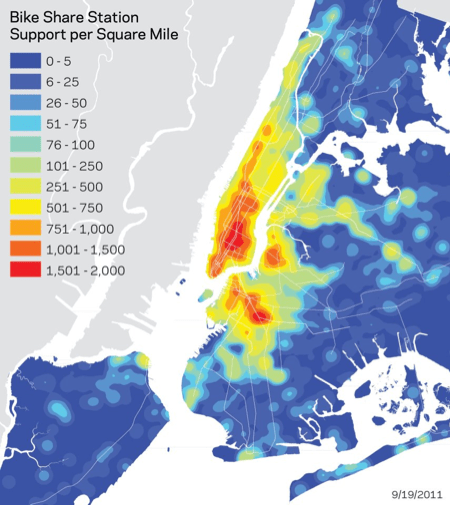
The DOT just released a heat map illustrating the number of bike share station suggestions and supports per square mile as of Monday. (It’s a relief to see the data broken out this way after the suggestion map was engulfed in a sea of blue squares.) While the deep red areas are striking, don’t ignore the vast swaths of yellow that cover the rest of Manhattan, much of northwest Brooklyn and large sections of Queens. Even the area around St. George in Staten Island is colored yellow, suggesting that people intuitively understand the utility of bike share for short trips and for making up the “last gaps” in the city’s transportation system.
As of today, DOT has received “5,566 individual station nominations and 32,887 support clicks,” or over 4,600 clicks per day since the official announcement last week. Support is surely bound to grow as DOT continues its outreach and demonstrations around the city and as they begin previewing the system next spring. The tabloids’ incessant and predictable nipping at the DOT’s heels is unlikely to curb that enthusiasm. The Venn diagram of New York Post readers and people who have suggested a bike share station is surely two separate circles.

Comments are closed.